While writing a recent post about the patchwork package it occurred to me that one use case for arranging plots would be to situate a plot next to a “zoomed in” version of itself. The following walks through an approach to do this using a new function called gg_zoom(). The function definition takes advantage of tidyeval to provide a simple API.
Given a ggplot2 object and a “zoom” command (same syntax as dplyr::filter() statement), gg_zoom() will internally filter the original plot data and then re-issue the initial plot call on the subset. The function includes an option to add a label to points (via ggrepel) if applicable, as well as an option to draw a box around the “zoom” data in the original plot. The original plot and its zoomed version will be returned in a patchwork layout, which can be customized using the same syntax as documented in the package’s “Controlling Layouts” vignette.
The examples in the post use historical NBA data from FiveThirtyEight. The data includes statistics (three point percentage, blocks per game, offensive efficiency rating, etc) by player for every season from 1977-2020. In total there are 20059 observations of 40 features. For simplicity, we’ll only look at data since 2010. The data is also restricted to only include statistics from players who played in at least 10 games with at least 10 minutes per game.
To begin we need to read in the data:
library(tidyverse)
library(patchwork)

nba_adv <-
  readr::read_csv("https://raw.githubusercontent.com/fivethirtyeight/nba-player-advanced-metrics/master/nba-data-historical.csv") %>%
  filter(year_id >= 2010) %>%
  filter(G >= 10 & MPG >= 10)
Next, we’ll define the gg_zoom(). Note comments inline describing the function guts:
gg_zoom <- function(.plot, zoom_cmd, draw_box = TRUE, box_nudge = 1, to_label = FALSE, label) {

  ## use enquo for tidyeval syntax
  zoom_cmd <- dplyr::enquo(zoom_cmd)

  ## subset data to zoom in on
  zoom_data <-
    .plot$data %>%
    dplyr::filter(!!zoom_cmd)

  ## build the "zoom plot" based on the original ggplot object
  zoom_plot <- .plot
  ## coerce the data element to be the filtered data
  zoom_plot$data <- zoom_data

  ## if label  arg then add a repel text label
  if(to_label) {

    ## tidyeval syntax allows for a bare column name to be supplied
    label <- dplyr::enquo(label)

    zoom_plot <-
      zoom_plot +
      ggrepel::geom_text_repel(aes(label = !!label))
  }

  ## if draw box then add a box around data used in zoom
  if(draw_box) {

    ## need to get x and y variables (stored as quosures) from ggplot2 object
    x <- .plot$mapping$x
    y <- .plot$mapping$y

    ## create min/max x and y values for box around full plot
    box_data <-
      zoom_data %>%
      dplyr::summarise(
        xmin = min(!!x, na.rm = TRUE),
        xmax = max(!!x, na.rm = TRUE),
        ymin = min(!!y, na.rm = TRUE),
        ymax = max(!!y, na.rm = TRUE)) %>%
    ## add to min and max so that the box sits just outside point
    dplyr::mutate(
      xmin = xmin -  box_nudge,
      xmax = xmax + box_nudge,
      ymin = ymin -  box_nudge,
      ymax = ymax +  box_nudge)

    ## use geom_rect to add to the plot
    .plot <-
      .plot +
      ggplot2::geom_rect(
        ggplot2::aes(xmin = box_data$xmin,
                     xmax = box_data$xmax,
                     ymin = box_data$ymin,
                     ymax = box_data$ymax),
        fill = NA,
        col = "grey",
        lty = "dotted")

  }

  ## return in a basic patchwork layout
  .plot + zoom_plot

}
The first example of gg_zoom() will start with a scatter plot of three point percentage by free throw percentage:
## scatter plot of 3P% by FT%
p1 <-
  nba_adv %>%
  ## add a column with the player name followed by year in ()
  ## used for label in plot
  mutate(name_year = paste0(name_common, " (", year_id, ")")) %>%
  ## remove incontrovertible outliers
  filter(`3P%` < 100 & `3P%` > 0 & `FT%` < 100 & `FT%` > 0) %>%
  ggplot(aes(`3P%`, `FT%`)) +
  geom_point() +
  ## add a trend line
  geom_smooth(method = "lm", se = FALSE, col = "firebrick") +
  theme_minimal()

p1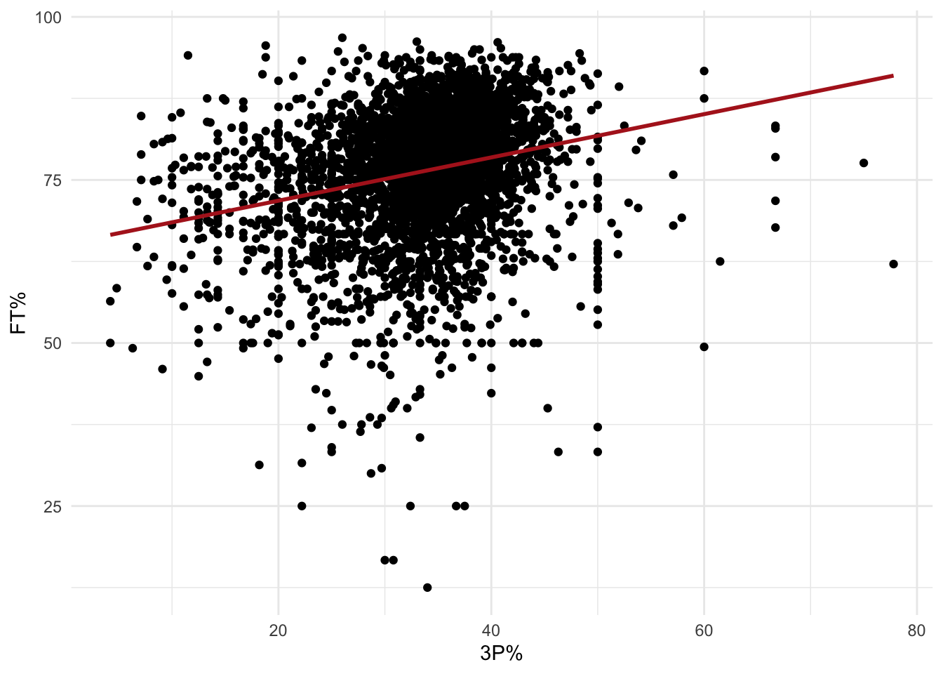
Now we’ll zoom in on players with seasons that featured particularly good free throw shooting (> 90%) but bad three point percentage (< 20%):
gg_zoom(.plot = p1,
        zoom_cmd = `3P%` < 20 & `FT%` > 90,
        to_label = TRUE,
        label = name_year)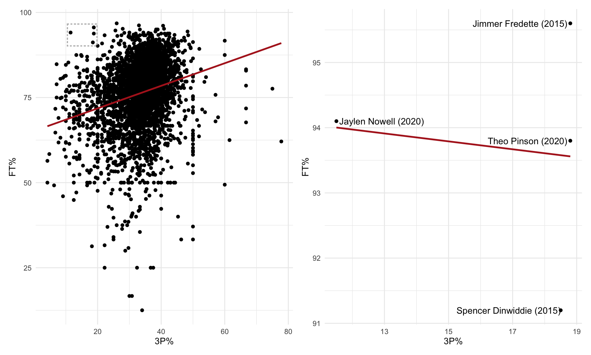
As mentioned above, the function returns a patchwork layout, which can be customized:
gg_zoom(p1,
        zoom_cmd = `3P%` < 20 & `FT%` > 90,
        to_label = TRUE,
        label = name_year) +
  plot_layout(widths = c(3,1))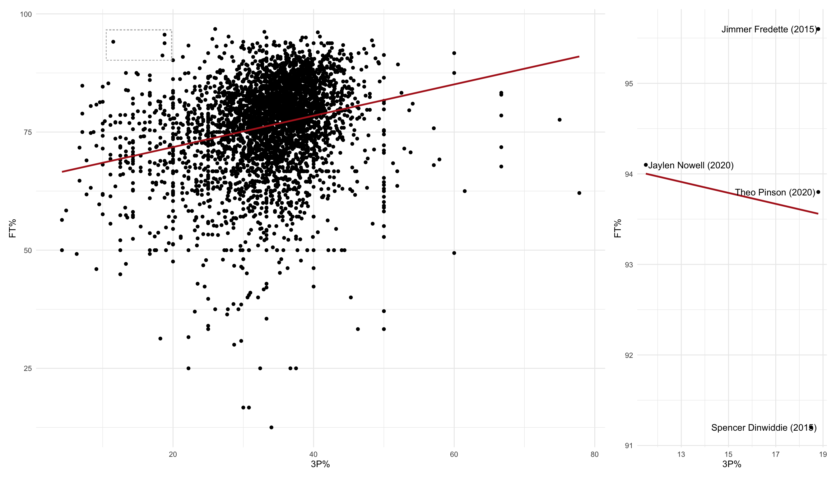
layout <- c(
  area(t = 1, l = 1, b = 5, r = 3),
  area(t = 1, l = 4, b = 2, r = 5)
)

gg_zoom(p1,
        zoom_cmd = `3P%` < 20 & `FT%` > 90,
        to_label = TRUE,
        label = name_year) +
  plot_layout(design = layout)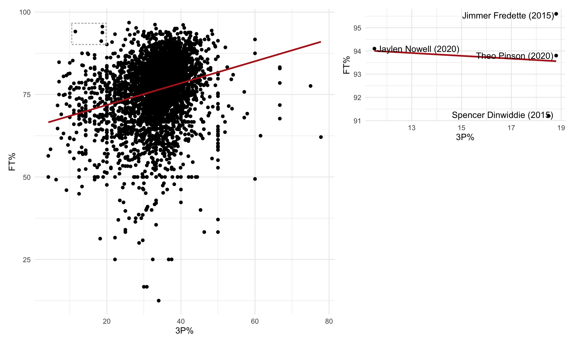
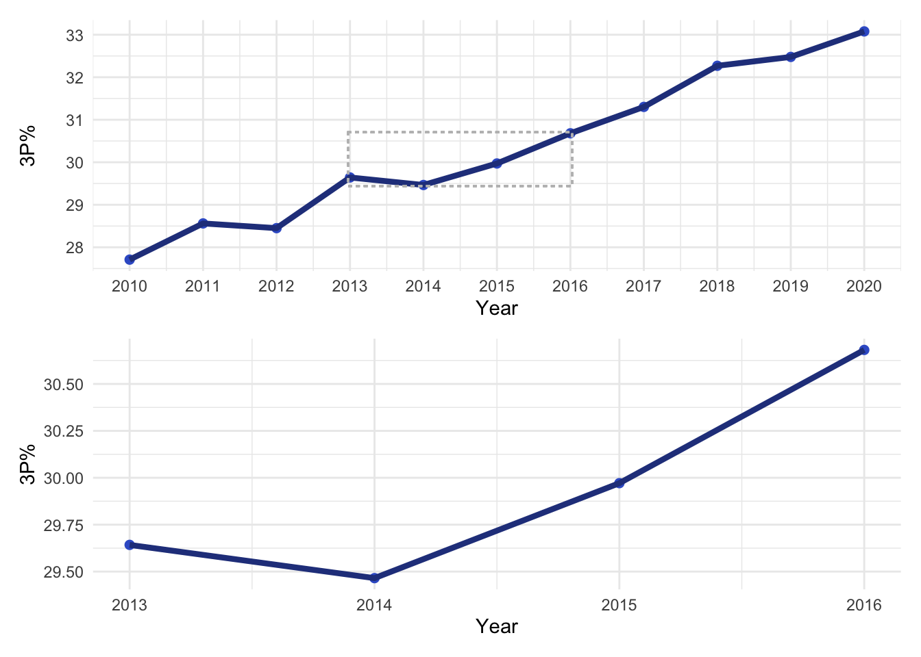
The second example will be based around a line plot of the average three point percentage by season across the entire NBA (for players who played in at least 10 games with at least 10 minutes per game):
## line plot of average 3P% by season
p2 <-
  nba_adv %>%
  ## get average three point percentage by year
  group_by(year_id) %>%
  summarise(`3P%` = mean(`3P%`, na.rm = TRUE),
            .groups = "drop") %>%
  ggplot(aes(year_id, `3P%`)) +
  geom_point(size = 2, col = "royalblue3") +
  geom_line(lwd = 1.5, col = "royalblue4") +
  scale_x_continuous(breaks = seq(2010,2020, by = 1)) +
  labs(x = "Year") +
  theme_minimal()

p2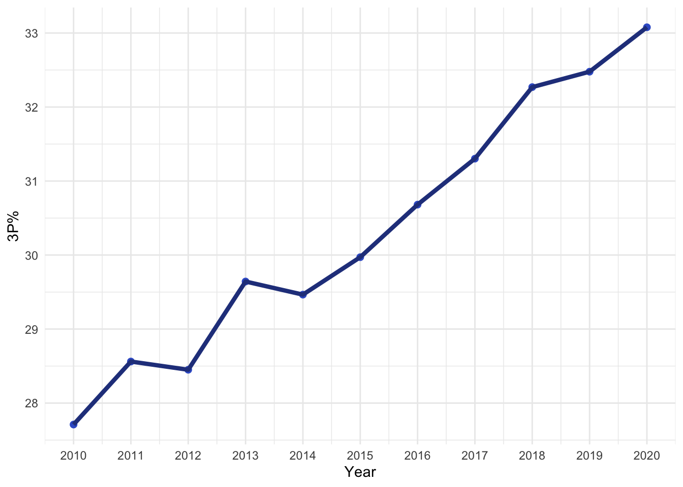
gg_zoom(p2,
        zoom_cmd = year_id > 2012 & year_id < 2017,
        to_label = FALSE,
        draw_box = TRUE,
        box_nudge = 0.025) +
  plot_layout(ncol = 1)