A colleague recently introduced me to the patchwork package, which is a set of tools for combining multiple ggplot2 plots into a single figure. I’ve used the plot_grid() function from the cowplot package to do this sort of thing in the past. What follows will be a demo showing the basics of arranging plots with patchwork.
The example figure will use historical NBA data from FiveThirtyEight. The data includes statistics (three point percentage, blocks per game, offensive efficiency rating, etc) by player for every season from 1977-2020. In total there are 20059 observations of 40 features. For simplicity, we’ll only look at data since 2010. The data is also restricted to only include statistics from players who played in at least 10 games with at least 10 minutes per game.
library(tidyverse)
library(patchwork)

nba_adv <-
  read_csv("https://raw.githubusercontent.com/fivethirtyeight/nba-player-advanced-metrics/master/nba-data-historical.csv") %>%
  filter(year_id >= 2010) %>%
  filter(G >= 10 & MPG >= 10)
Component plots of this data will explore various questions about free throw percentage.
The first plot summarizes the average free throw percentage by team:
ft_team <-
  nba_adv %>%
  group_by(team_id) %>%
  summarise(`FT%` = mean(`FT%`, na.rm = TRUE), .groups = "drop") %>%
  ggplot(aes(reorder(team_id, `FT%`), `FT%`)) +
  geom_col() +
  coord_flip() +
  labs(x = NULL) +
  theme_minimal()

ft_team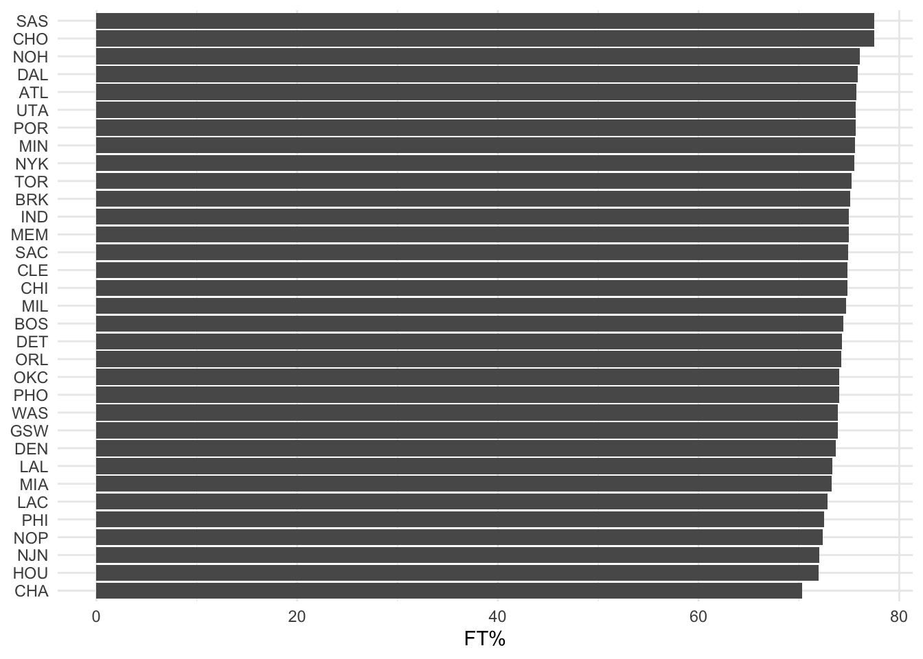
The second “plot” will be actually a table showing the data at the individual level. Players who have at least 5 seasons of data are sorted by free throw percentage, with the top 10 shown in the table:
ft_player_table <-
  nba_adv %>%
  group_by(name_common) %>%
  summarise(
    pct = paste0(`FT%`, collapse = ";"),
    n = n(),
    se = sd(`FT%`, na.rm = TRUE)/sqrt(n),
    mean = mean(`FT%`, na.rm = TRUE),
    mean = round(mean, digits = 2),
    .groups = "drop") %>%
  filter(n >= 5) %>%
  arrange(desc(mean)) %>%
  head(10) %>%
  select(Name = name_common, `FT%` = mean) %>%
  gridExtra::tableGrob(., rows = NULL)

gridExtra::grid.arrange(ft_player_table)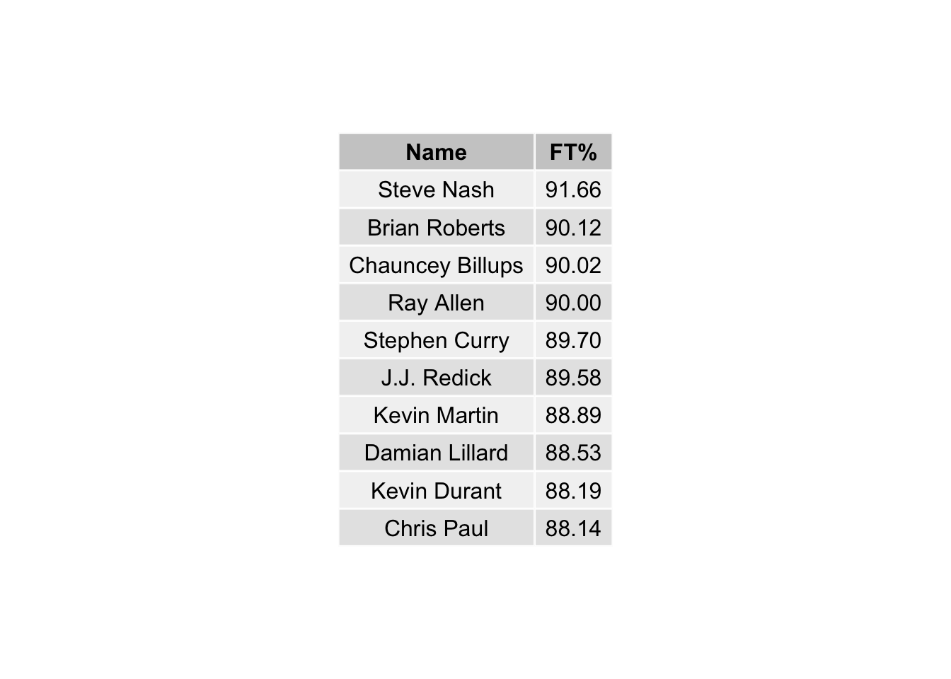
The last plot will look at the distributions of free throw percentage by position:
ft_dist <-
  nba_adv %>%
  ggplot(aes(`FT%`)) +
  geom_density(aes(fill = pos, col = pos)) +
  theme_minimal() +
  labs(y = "Density") +
  theme(legend.title = element_blank(),
        legend.position = "bottom")

ft_dist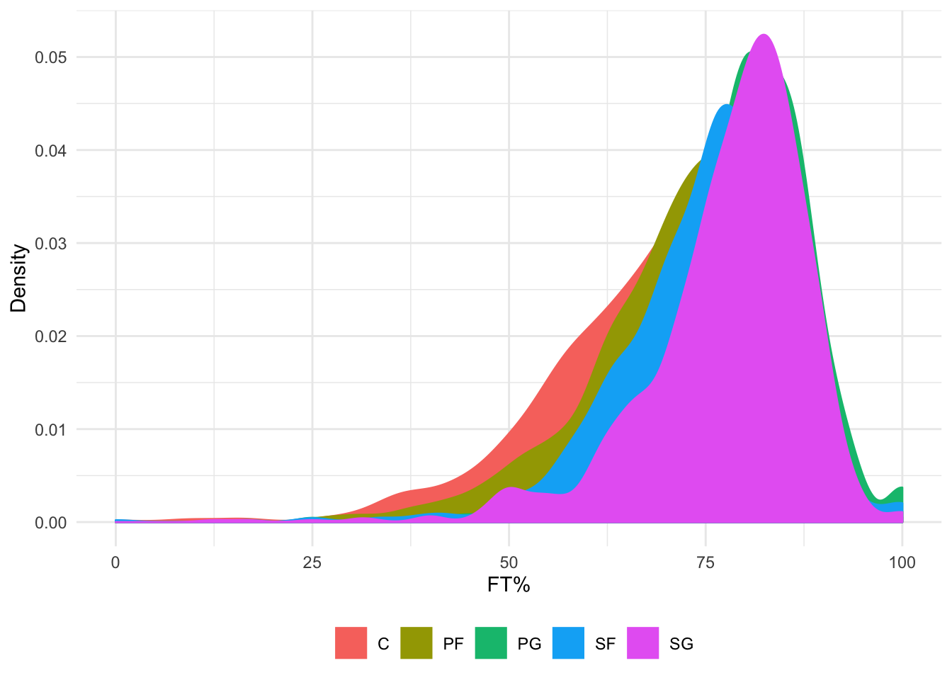
OK back to patchwork … we have individual plot objects created. Now to combine them together. We can try several different layouts.
ft_team / ft_player_table / ft_dist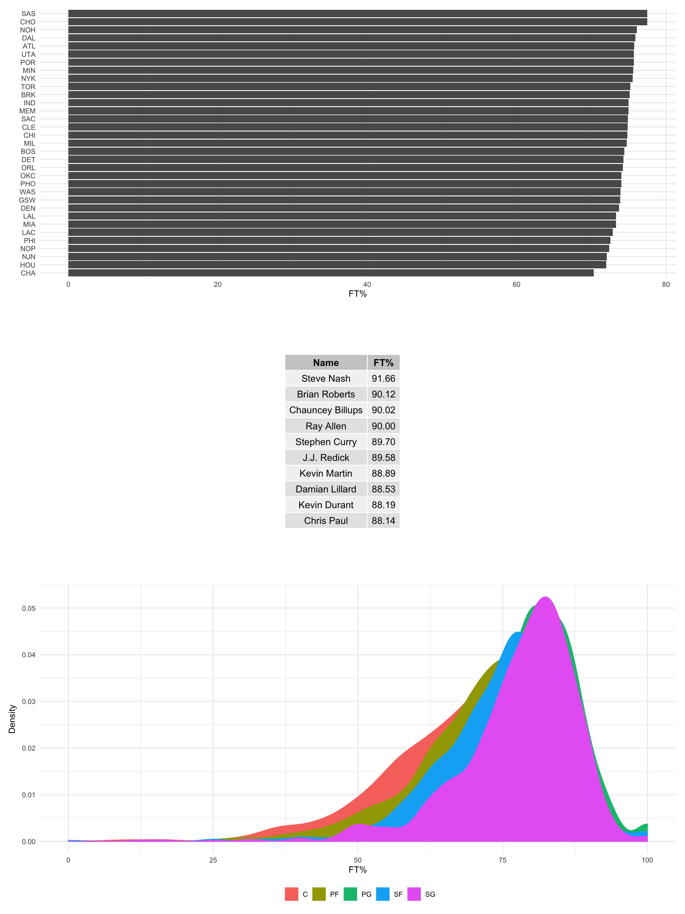
ft_team + ft_player_table + ft_dist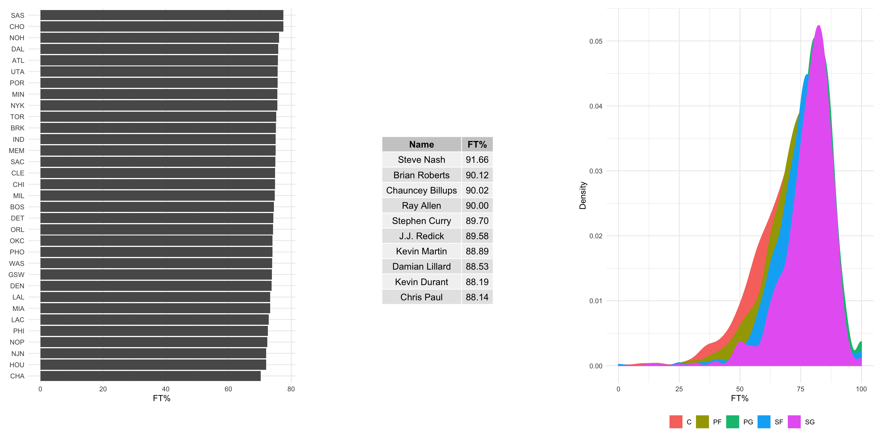
(ft_team + ft_player_table) / ft_dist 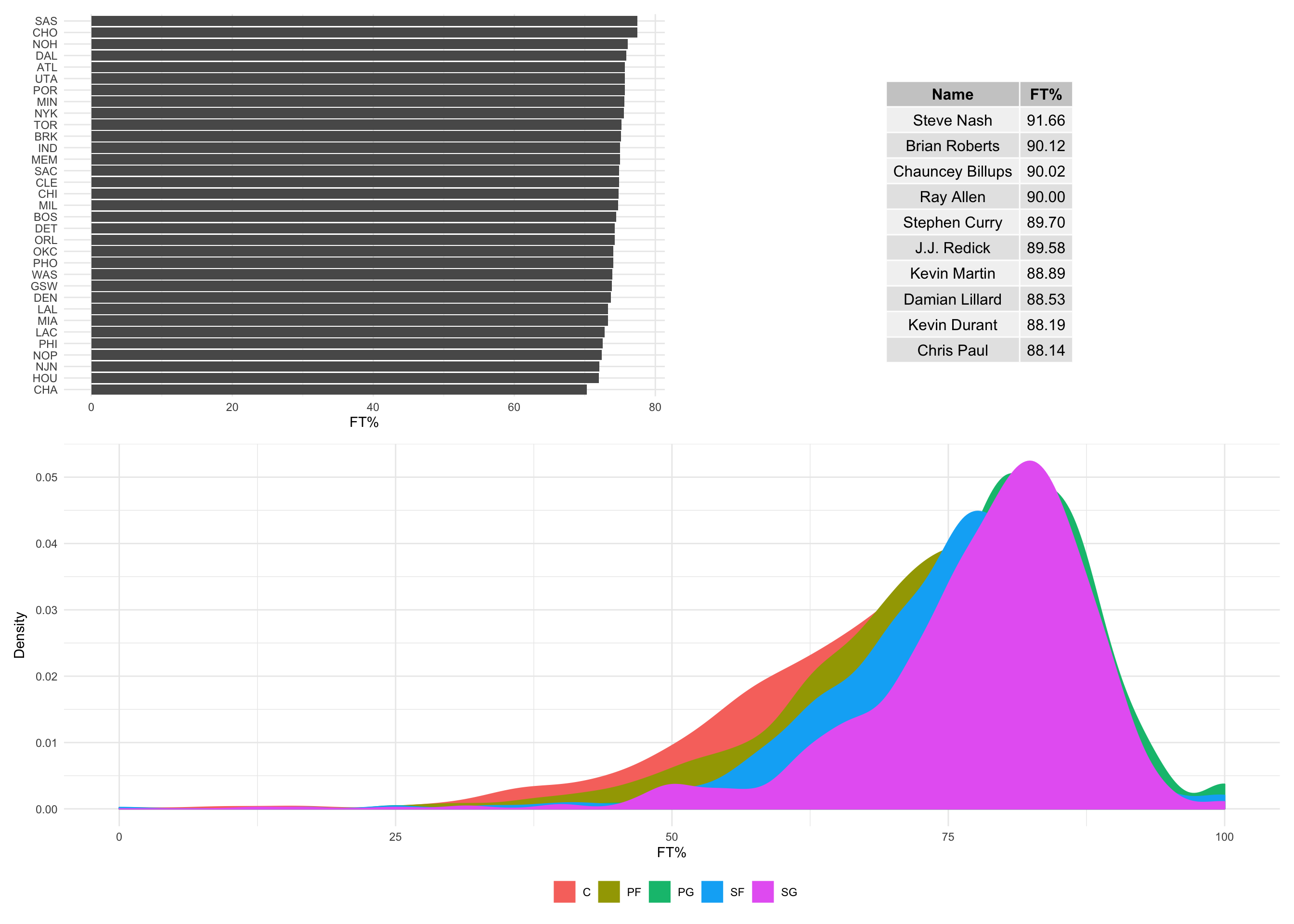
Assuming we like the last one the best, let’s use it again but this time add an annotation to the plot. The plot_annotation() function allows for iterative tags with the “tag_levels” argument. You can also add a title, subtitle, and/or a caption to the figure:
(ft_team + ft_player_table) / ft_dist +
  plot_annotation(tag_levels = c("A"),
                  tag_suffix = ")",
                  caption = "Exploration of free throw shooting percentage in the NBA from 2010 to 2020.\nPanel A includes average free throw percentage by team. Franchises that have moved locations in the time frame (i.e. the New Orleans/Charlotte Hornets) are represented twice.\nPanel B features the top 10 players by percentage. Players had to have at least 10 games played, with 10 minutes per game and 5 seasons in the time frame to be included.\nPanel C shows the distribution of free throw percentage by position.\nData source: https://github.com/fivethirtyeight/nba-player-advanced-metrics",
                  title = "NBA Free Throw Shooting %",
                  subtitle = "2010-2020",
                  theme = theme(plot.caption = element_text(hjust = 0)))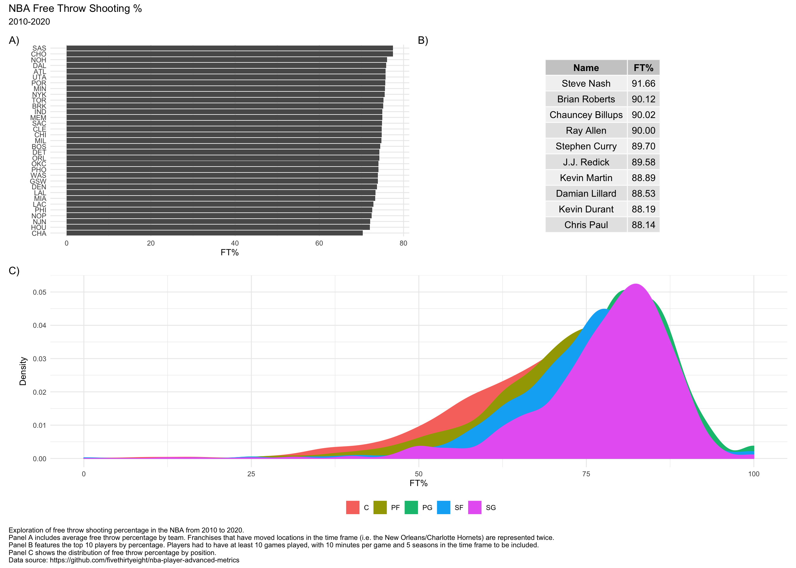
patchwork has a lot of other features for making compelling arrangments of graphics. The package vignettes are great resources for learning more.