A receiver operating characteristic curve, or ROC curve, is a graphical plot that illustrates the diagnostic ability of a binary classifier system as its discrimination threshold is varied.1
There is plenty of available information on how to plot ROC curves in R:
- https://blog.revolutionanalytics.com/2016/08/roc-curves-in-two-lines-of-code.html
- https://cran.r-project.org/web/packages/plotROC/vignettes/examples.html
- https://campus.datacamp.com/courses/machine-learning-with-tree-based-models-in-r/boosted-trees?ex=12
- https://www.youtube.com/watch?v=qcvAqAH60Yw
A 2019 RViews post compares different methods side-by-side:
https://rviews.rstudio.com/2019/03/01/some-r-packages-for-roc-curves/
The example that follows provides a documented method I have used to plot ROC curves, both with the pROC package alone … and also using data from the pROC ROC AUC object and ggplot2.
First, some code for to prepare the data (the Titanic dataset in this case) for modeling:
library(dplyr)

expand_counts <- function(.data, freq_col) {

  quo_freq <- dplyr::enquo(freq_col)

  freqs <- dplyr::pull(.data, !!quo_freq)

  ind <- rep(seq_len(nrow(.data)), freqs)

  # Drop count column
  .data <- dplyr::select(.data, - !!quo_freq)

  # Get the rows from x
  .data[ind, ]

}

titanic <-
  as.data.frame(Titanic, stringsAsFactors = FALSE) %>%
  expand_counts(Freq) %>%
  mutate(Survived = ifelse(Survived == "Yes", 1, 0))

as.data.frame(Titanic)
## Class Sex Age Survived Freq
## 1 1st Male Child No 0
## 2 2nd Male Child No 0
## 3 3rd Male Child No 35
## 4 Crew Male Child No 0
## 5 1st Female Child No 0
## 6 2nd Female Child No 0
## 7 3rd Female Child No 17
## 8 Crew Female Child No 0
## 9 1st Male Adult No 118
## 10 2nd Male Adult No 154
## 11 3rd Male Adult No 387
## 12 Crew Male Adult No 670
## 13 1st Female Adult No 4
## 14 2nd Female Adult No 13
## 15 3rd Female Adult No 89
## 16 Crew Female Adult No 3
## 17 1st Male Child Yes 5
## 18 2nd Male Child Yes 11
## 19 3rd Male Child Yes 13
## 20 Crew Male Child Yes 0
## 21 1st Female Child Yes 1
## 22 2nd Female Child Yes 13
## 23 3rd Female Child Yes 14
## 24 Crew Female Child Yes 0
## 25 1st Male Adult Yes 57
## 26 2nd Male Adult Yes 14
## 27 3rd Male Adult Yes 75
## 28 Crew Male Adult Yes 192
## 29 1st Female Adult Yes 140
## 30 2nd Female Adult Yes 80
## 31 3rd Female Adult Yes 76
## 32 Crew Female Adult Yes 20sample_n(titanic, 10)## Class Sex Age Survived
## 1 3rd Male Adult 0
## 2 1st Male Adult 0
## 3 2nd Male Adult 0
## 4 Crew Male Adult 0
## 5 Crew Male Adult 0
## 6 3rd Male Adult 0
## 7 Crew Male Adult 0
## 8 Crew Male Adult 1
## 9 Crew Male Adult 0
## 10 1st Female Adult 1The model will predict survival (yes/no) from the Titanic. Predictors will include class, sex, and age. We’ll look at a model of with passenger class as the only predictor versus a model that includes class, sex, and age.
Survived ~ Class
library(pROC)

fit1 <- glm(Survived ~ Class, data = titanic, family = binomial)

prob <- predict(fit1,type=c("response"))

fit1$prob <- prob

roc1 <- roc(Survived ~ prob, data = titanic, plot = FALSE)

roc1
##
## Call:
## roc.formula(formula = Survived ~ prob, data = titanic, plot = FALSE)
##
## Data: prob in 1490 controls (Survived 0) < 711 cases (Survived 1).
## Area under the curve: 0.6417Survived ~ Class + Sex + Age
fit2 <- glm(Survived ~ Class + Sex + Age, data = titanic, family = binomial)

prob <- predict(fit2,type=c("response"))

fit2$prob <- prob

roc2 <- roc(Survived ~ prob, data = titanic, plot = FALSE)

roc2
##
## Call:
## roc.formula(formula = Survived ~ prob, data = titanic, plot = FALSE)
##
## Data: prob in 1490 controls (Survived 0) < 711 cases (Survived 1).
## Area under the curve: 0.7597plot(roc1, lty = "solid")
lines(roc2, lty = "dotted")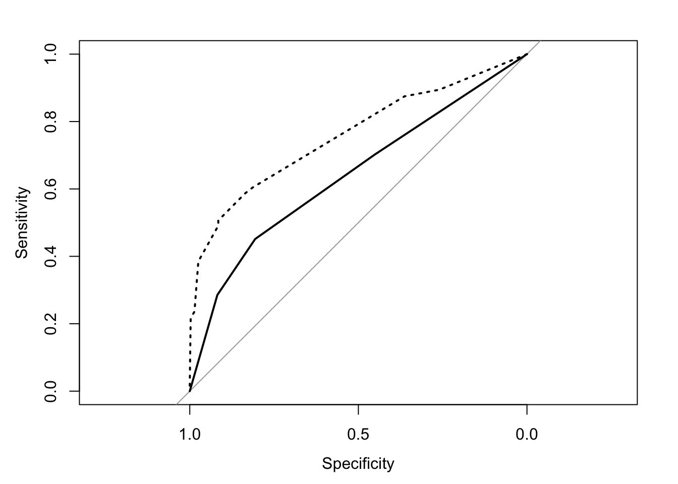
library(ggplot2)

df1 <-
  data_frame(
    sensitivity = roc1$sensitivities,
    specificity = roc1$specificities,
    thresholds = roc1$thresholds,
    model = "Survived ~ Class"
  )

df2 <-
  data_frame(
    sensitivity = roc2$sensitivities,
    specificity = roc2$specificities,
    thresholds = roc2$thresholds,
    model = "Survived ~ Class + Sex + Age"
  )

rbind(df1,df2) %>%
  ggplot(aes(1-specificity, sensitivity)) +
  geom_line(aes(group = model, lty = model)) +
  theme(legend.position = "bottom",
        legend.title = element_blank())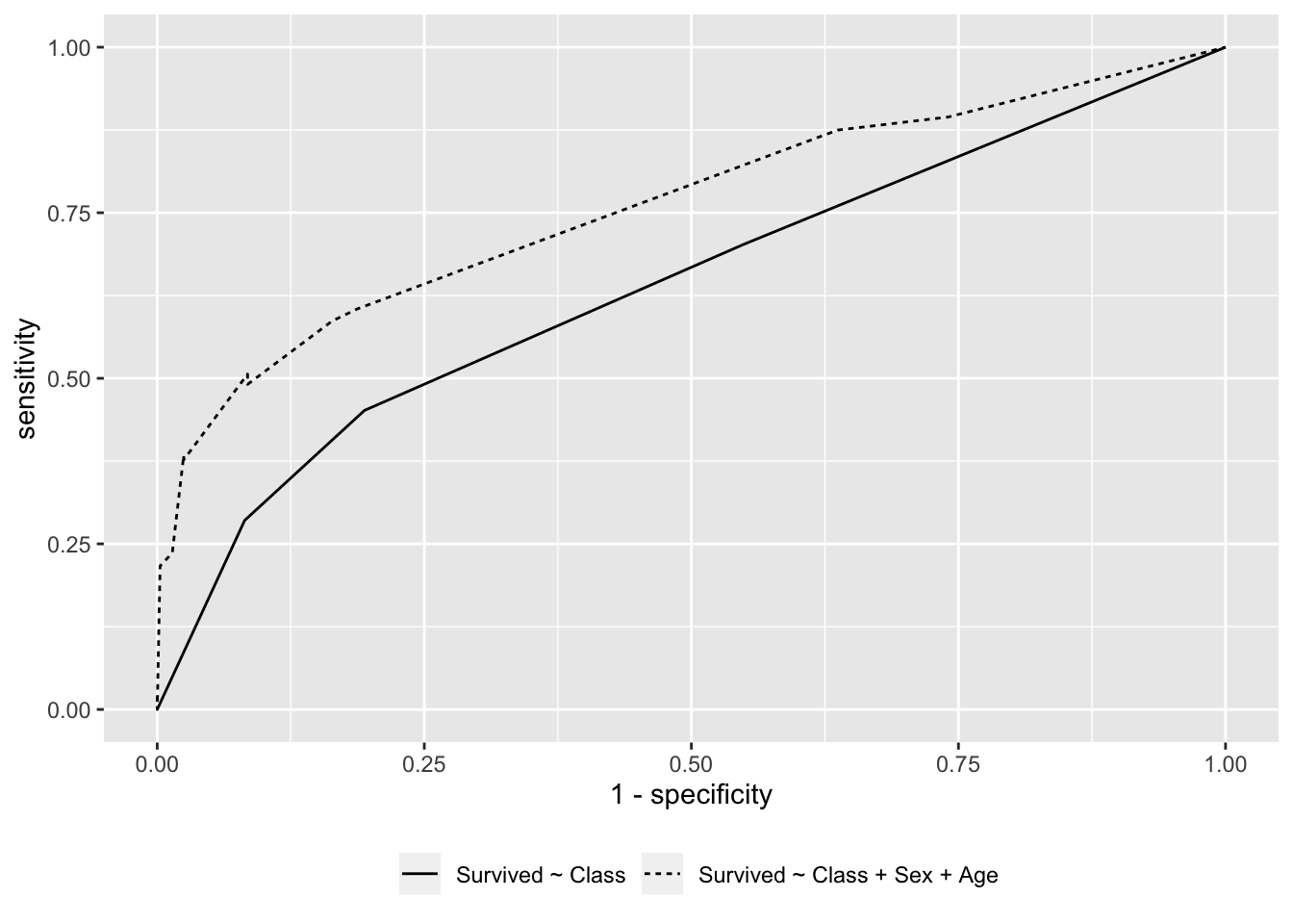
From Receiver operating characteristic by Wikipedia licensed under CC BY-SA 3.0.↩